
With data visualisation, the sky’s the limit
When it comes to explaining concepts of investing to clients, we tend to focus on the information we want to impart, often leaning on graphs and charts to bring investing ideas to life.
There’s nothing wrong with that.
But these are ideas that are intended to pique clients’ interest, inspire their trust and excite them.
And surely there’s no better way to do this than to ensure you’re as entertaining as you are informative.
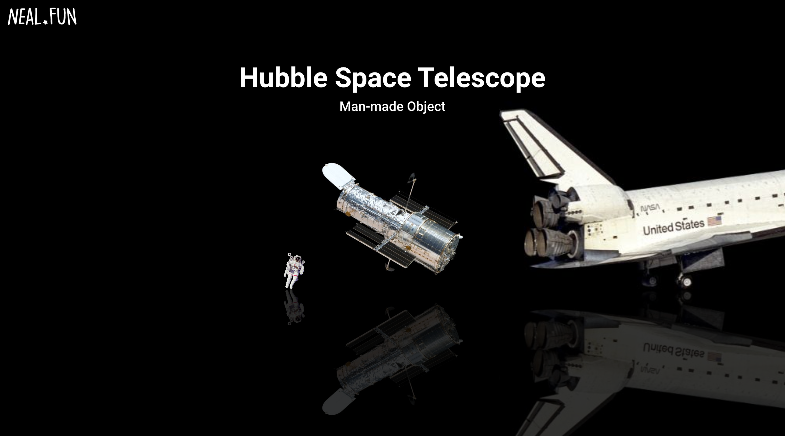
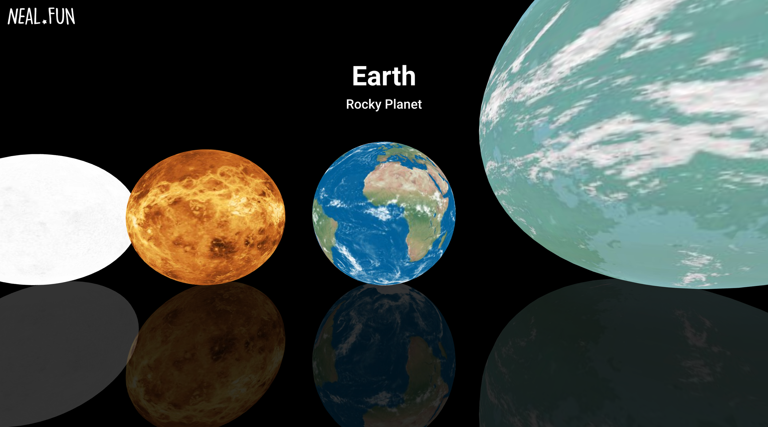
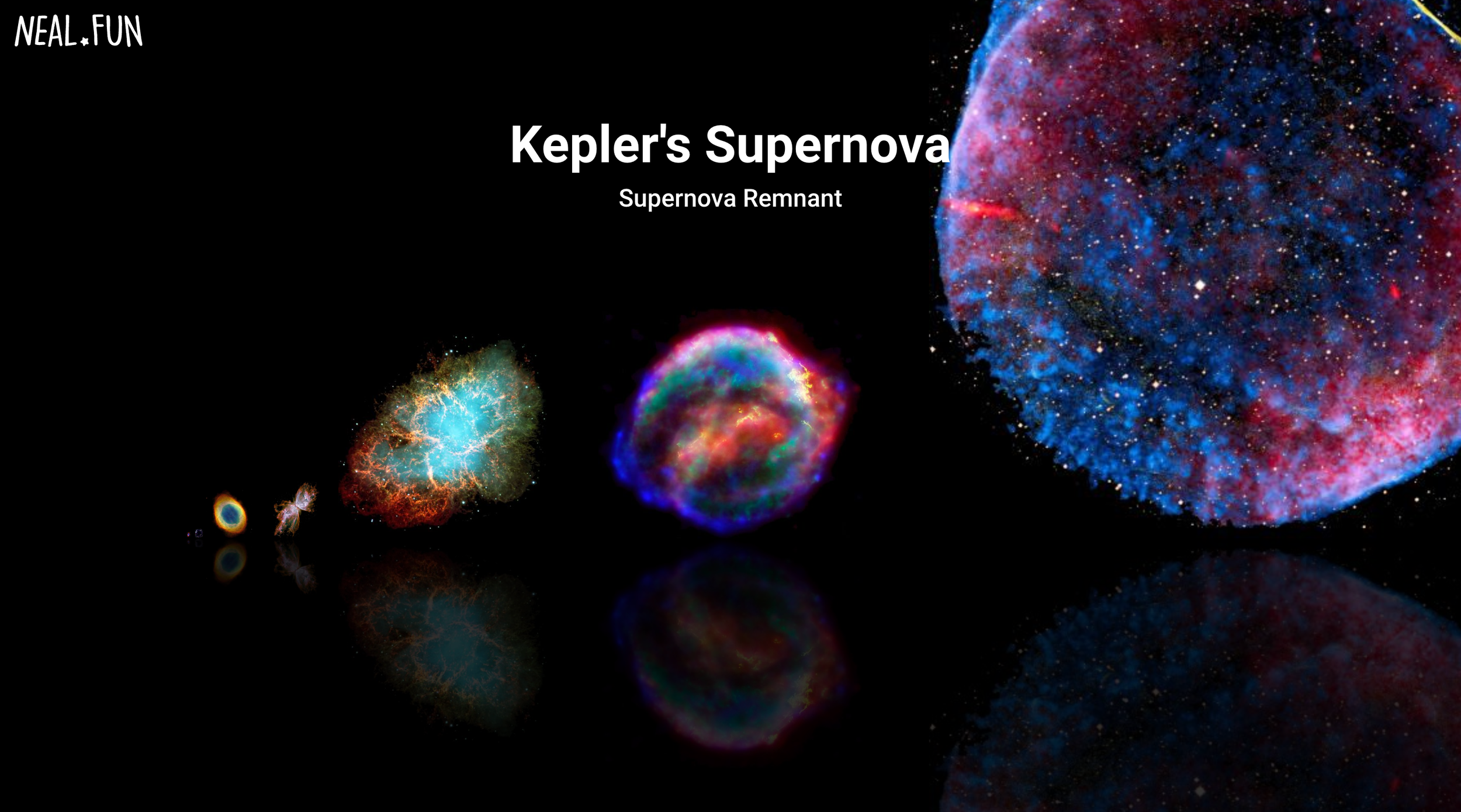
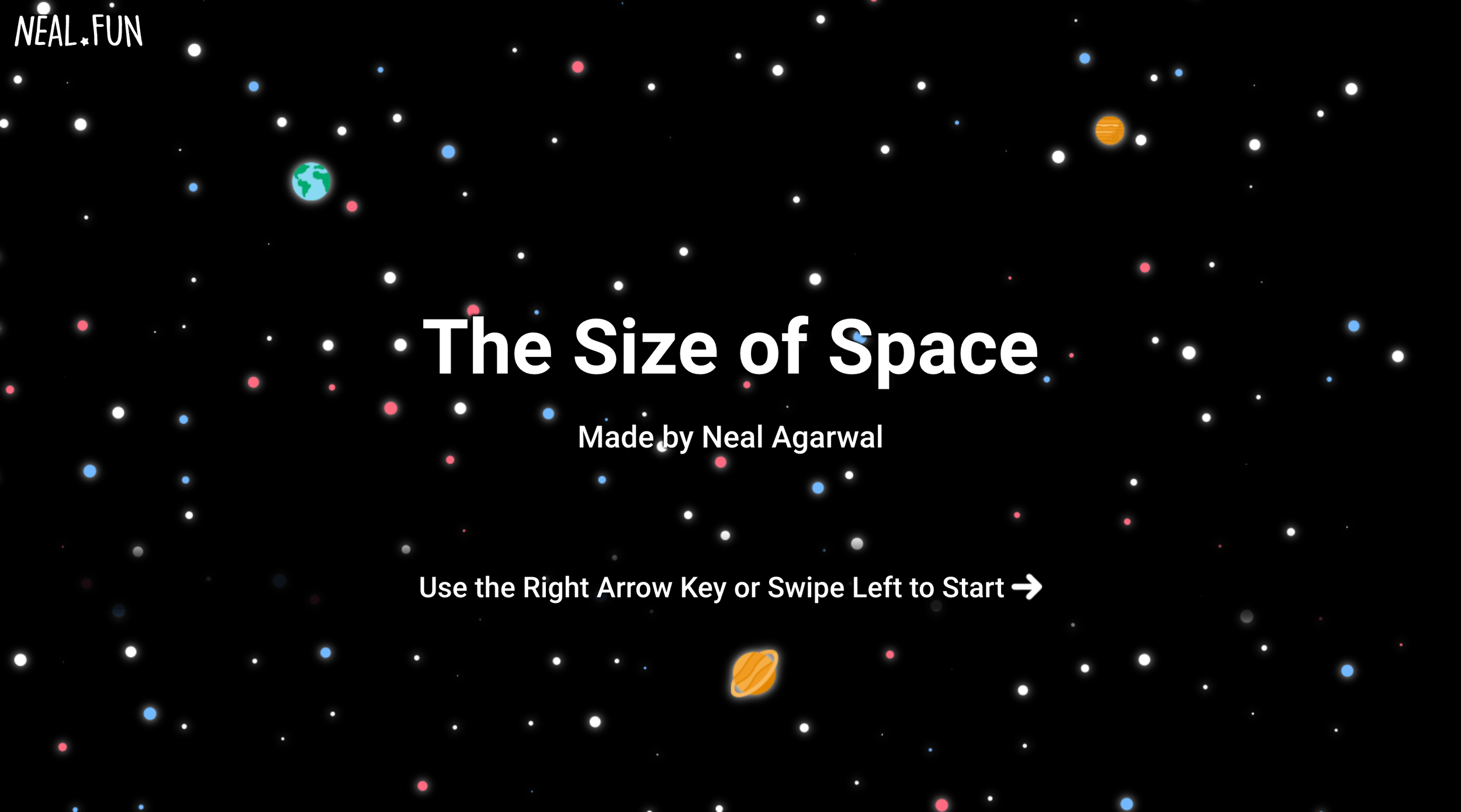
Take the Size of Space by the designer Neal. Designed to make it dead easy for you to explore the universe, within a couple of seconds, it’s so much easier to picture how it all compares and fits together. Who knew how small Mars is? Or how tiny the Earth is when compared to Kepler-22b or Neptune for that matter. It’s utterly mind blowing and absorbing.
While it’s not financial planning, you can imagine how easy it would be to apply these principles to investment and financial concepts or data.
And, push your imagination a little further, how much more interesting this would be for clients.
So next time you’re about to share information in graphs, charts or data tables, ask yourself whether it’s worth investing in something that really brings the data to life for people - something that shoots for the stars.
Update: Since writing this post, Ian’s discovered two more fantastic examples of visualising space. So if visualising space (and data) is your thing, here you go: